Project. A New Message
Purpose. To introduce second-year graphic design students to type and content-based hierarchy, legibility, tone, format, and consistency based on personal, experienced content--a text message received on their mobile phone.
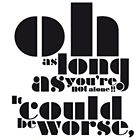
Assignment. Students scroll through their mobile phone text messages and choose three. All of the information that is included with the message is recorded ie. time, date, year, etc in the same format as it was received. Shortened text-speech is lengthened out to full terminology.
ie. LOL = laughing out loud, CU = see you.
Working in small groups, students exchange message printouts and respond to them in writing; describing the content, assumptions on the context, the sender and tone.
Students are shown a selection of contemporary, non-English-language typographic posters; each student is given one poster to analyse; looking specifically at the relevance between design and content.
Students follow a tutorial to set up their document so that all submissions are the same size and have the same features. They begin working on the layout of their messages using only the fonts included on the school computers (a very basic set!) and conceptually based around the content and tone of the message. They are required to work in black and white with no decoration/illustration and work in a format size that is typically unfamiliar: half A1 (dimensions below).
Students choose one design to take forward and refine. As part of the layout, they are required to develop a 'project context' statement that accompanies their design. This two-line statement sums up the environment or situation in which the text message was received.
Students continue to refine their layout, type treatment, content hierarchy, and project context blurbs.Final critiques are done based on printed proofs with specific attention given to format/submission requirements, leading, readability, spelling, flow and balance.
Submission requirements: one pdf of final with trim-marks and one black and white scaled A3 proof with trim-marks
One of the highlights of this project is the possibilities of the end-result. We selected a range of the most resolved projects and had them printed onto PVC vinyl banners. This selection of banners was turned into a second-year design-student typography exhibition. Other possibilities would include using the designs on street-banners/flags, t-shirts, laser and vinyl-cutting.
Format. 41.5 cm x 115.4 cm (16 x 46 inches)
Time. Four weekly 3.5-hour meetings.
|