Project. Handwritten Typography
Purpose. Handwriting is commonplace in our everyday lives and yet is rare in visual messages. Indeed, it is so common that it is often overlooked as a form of typography and is rightly considered much less formal, legible, and precise than is set typography. When used to communicate messages, it is chosen because it offers so much more than specific information, as handwritten messages become dynamic statements of individual style, personal communication, and spontaneous creation.
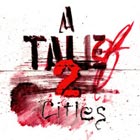
Assignment. Choose a title of a classic novel or film and use hand-graphic means and a variety of media to create words that have expressive connotations so powerful as to become dynamic images.
1. Create Templates
Set your title in large scale computer-generated type in a variety of fonts appropriate to the content. This set type becomes a template for creative exploration.
2. Experimental Work on Trace
Work on tracing paper over the set type with a variety of media such as pencil, paint, chalk, marker, and pastels. Produce at least 30 versions of your title. The objective is to try as many different tools and media as possible.
3. Selection and Expansion
Review all 30 variations and choose the 5 versions that best suit the content of the book or film. Use those 5 versions as a starting point to create a minimum of 10 variations on each version - 50 total. Some of the most expressive letterforms are the result of “mistakes” such as spilled ink and splots, drips, and filled in counters.
4. Choose & Scan the Most Expressive
From your 50 versions select the most appropriate, expressive, and interesting works. Scan those works in high resolution for compositing.
5. Composite Final
Select the best work and composite on the computer. Designers will want to retouch to enhance readability, replace individual letterforms, overlap, and adjust spacing in Photoshop.
Format. Titles: 11 inch square. First Pages : 11 X 17 inches. DVD Covers: fit to case.
Time. Two weeks |