Project. Basic typography:
word expressions & typographic studies.
Purpose. To encourage students to
explore the relationship between written and typographic letterforms
and the contexts in which typographic communication exists.
Assignment. This is the first project
of a five-week basic typography course for year one Visual Communication
students. The first part of the project is about divergent thinking.
It encourages experimentation and the discovery of the expressive
potential of written and typeset letterforms. The second part is
about convergent thinking. Students combine some of the letterform
experiments with text typography to create typographic studies
that meet specific formal requirements or communication objectives.
Composition issues such as contrast, rhythm, repetition, axis and
hierarchy were also addressed. Principles of Roman and Italic calligraphy
were introduced prior to this project, and samples of 17 classic
typefaces were provided to the students for studying in detail.
This
project is not about rules, conventions or the traditional aesthetic
values of typography, but to engage the students in experimentations
and composition without fear of making mistakes. Students were
encouraged to use their intuition, and the objectives for the
layouts in part two were loosely defined and open to interpretation.
I
was keen to make students aware that typographic communication
is not about immutable rules, but changes according to context.
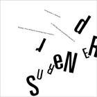
Part 1: Fifty word expressions
1. You have been assigned
a word. Look up its meaning in an English dictionary.
2. Create 50 visual expressions of this word, by
means of written and typographic forms (ten of these will be typeset
from the set
of 17 classic typefaces assigned to you). You are encouraged
to
be inventive and use a variety of writing tools and perhaps found
objects. Explore unusual papers, inks and pigments. Try out different
x-heights, ascender/descender lengths, proportions, stroke widths
and weights. Consider how these words sound. Some words are short
and sharp: staccato, in musical terms. Some words are longer
and more flowing: legato. Try to translate this audio experience
into
a visual one. Do not try to create pictorial interpretations
of the word. Experiment and have fun!
3.Typeset the definition of this
word in 12-point type on 17 point leading in a sanserif typeface
(again chosen from the list of 17
typefaces you were given on the first class). Duplicate this
20 times on one sheet of A4 and print it out and bring it to next
class for creating typographic compositions.
Part 2: Twenty typographic
studies
Using the 50 word expressions and the definition you have typeset,
create 20 layouts according the following objectives. Use the photocopier
to enlarge, reduce and repeat. Do not work directly on the computer—please
cut and paste by hand.
Objectives:
A structured composition
Minimal
Low contrast
High contrast
A static layout (symmetrical)
A dynamic layout (asymmetrical)
For an elderly person
Causes frustration
Authoritative
For a poet
Objective
For an engineer
Uses repetition
Experimental
Invisible/ordinary
For someone who is visually impaired
Emotional
For someone who is illiterate
With an image
Illegible
Format. Part One: A4, black and
white only. Part Two: 18 x 18 cm, black and white only
(gray tones are allowed)
Time. Fifty word expressions: 1
week. Twenty typographic studies: 1 week
|