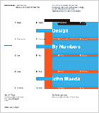
| Project. Typographic
Book Cover
Purpose. To explore
the possibilities of type and design within the restrictions
of a given paper format, a provided text, and fixed type sizes.
Assignment. Examine
the text and decide how it should be divided with type choices
for hierarchy, logic, content and clarity. Explore a variety
of type faces and type sizes with respect to the given format.
Through comparison arrive at a type choice, not a type composition,
that harmonizes with the given format. Limit your choice to not
more than three sizes. This type choice will remain the same
throughout the assignment. The only differences will be in the
variety of arrangements and compositions of the type in the space.
Cut your typeset copy, separating the words. Arrange
the type by hand on paper and fix them with tape. Make multiple
compositions exploring different arrangements. At the end make
a selection of the better ones. From those choose one as the best.
Set that composition on the computer and print it out. This one
composition will be the basis of all your further typographic studies
with first line, second shape, third screens, and fourth color.
For line, draw over your printed type composition.
For shape, print in black and white an original and an inverted
copy of your chosen composition. Cut shapes from the black and
white versions and fix them with tape. For screens, print a variety
of gray values using different halftone screens available to the
printer with your type composition overlaid in black and white.
With these prints, cut and compose, and fix with tape. For color,
print out or photocopy color versions of your type composition
and your halftone screens. With these color printouts again cut,
compose, and fix with tape.
From the hundreds of variations choose approximately
10 to 15 from each section: type, line, shape, screens, and color,
to show the progression and variety of your ideas. The emphasis
on the hand craft is to allow you to see clearly the relationship
between the type, space, and graphics in a direct one-to-one relationship
without the interference of the computer as a tool. If desired
you can make mechanicals of the paper compositions on the computer.
Format. 8.27
x 9.45 inches (22 X 24 centimeters)
Time. Half-Semester
|
|